
The Brief
The Client & Concept
This conceptual project was inspired by the idea of a retreat created for people experiencing anxiety, depression, burnout, and other emotional challenges.
Rather than offering a traditional wellness getaway centered primarily on relaxation, Tranquility Retreat was envisioned as a place where guests could step away from the pressures of everyday life, reconnect with themselves, and spend time alongside others facing similar experiences.
Through yoga, meditation, art therapy, mindfulness practices, and community-based activities, the retreat encourages emotional recovery and personal growth while providing an environment designed for reflection, connection, and meaningful change.
The Challenge
Mental health can be a deeply personal and sensitive subject, making trust one of the most important aspects of the brand.
The challenge was to create an identity that felt warm, reassuring, and professional without relying on clichés often associated with the wellness industry. Every element, from the messaging and visual identity to the website, needed to communicate safety, empathy, and credibility while encouraging visitors to take the first step toward seeking support.
Beyond introducing the retreat and its philosophy, the website also needed to explain the programs, answer common questions, and make it easy for potential guests to enquire about upcoming retreats.
Services Provided
To support these objectives, the following services were provided:
- Brand Development (Brand Positioning, Naming, Messaging, Identity)
- Visual Identity Design (Logo, Color Palette, Typography)
- Website Strategy
- Information Architecture
- Blog structure implementation
- Website Design and Development
- Search Engine Optimization (SEO)
The Objective
The project had two primary objectives.
The first was to develop a brand identity that would position Tranquility Retreat as a trusted place for emotional recovery, personal growth, and meaningful human connection. This included defining the brand strategy, positioning, messaging, naming, and visual identity.
The second was to create a website that would become the retreat’s primary source of information and a key part of the guest journey. Its role included helping visitors explore the programs and activities, find answers to common questions, and move easily toward making an enquiry. At the same time, the website needed to support long-term discoverability through educational content and a strong SEO foundation.
Brand Development
Brand Positioning
The brand was positioned around a simple idea:
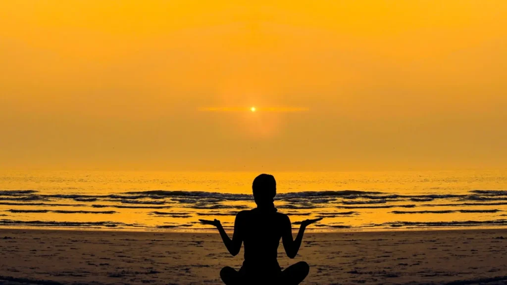
Healing begins when people feel safe enough to slow down, reconnect with themselves, and realize they don’t have to face life’s challenges alone.
While many wellness retreats focus primarily on relaxation or luxury experiences, Tranquility Retreat places emotional well-being and genuine human connection at the center of the experience. The emphasis is not simply on taking a break from everyday life, but on creating an environment where guests feel understood, supported, and encouraged throughout their personal journey.
By combining professional guidance, therapeutic activities, and a strong sense of community, the retreat creates a space where emotional recovery and personal growth can happen naturally.
Naming
The name Tranquility Retreat reflects both the purpose of the experience and the transformation it aims to create.
“Tranquility” represents the sense of balance and emotional clarity that guests seek, while “Retreat” communicates a place where they can step away from the demands of everyday life and focus on their well-being.
The results is a name that immediately signals the calm, restorative experience visitors can expect.
Brand Message
To translate the brand’s positioning into a clear and reassuring promise, the messaging was developed around the retreat’s core values.
The tagline “A Safe Space to Heal, Connect, and Grow” communicates the retreat’s commitment to creating an environment where guests feel supported throughout their journey, while the headline “Find Your Inner Peace” captures the emotional outcome the experience is designed to help them achieve.
Together, they introduce the brand with a message that is both aspirational and reassuring, setting clear expectations before visitors explore the rest of the website.
Visual Identity
The visual identity was created to reflect the retreat’s positioning while establishing the level of professionalism expected from a mental health and wellness brand.
Logo Design
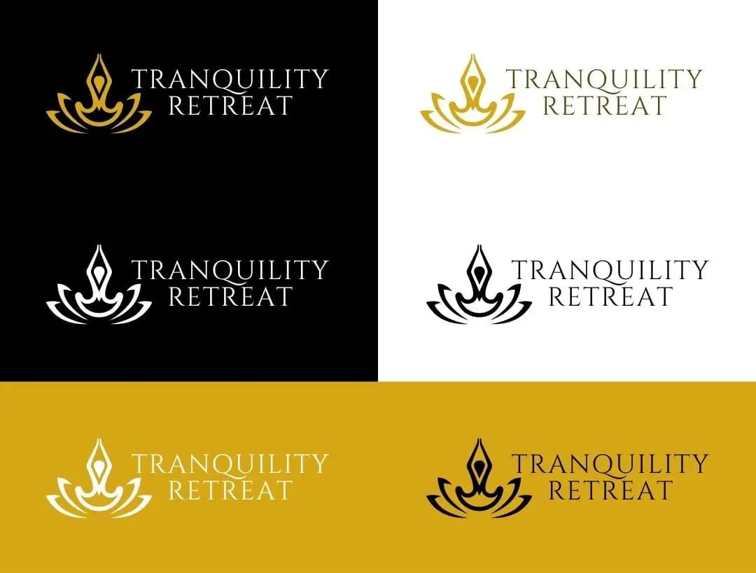
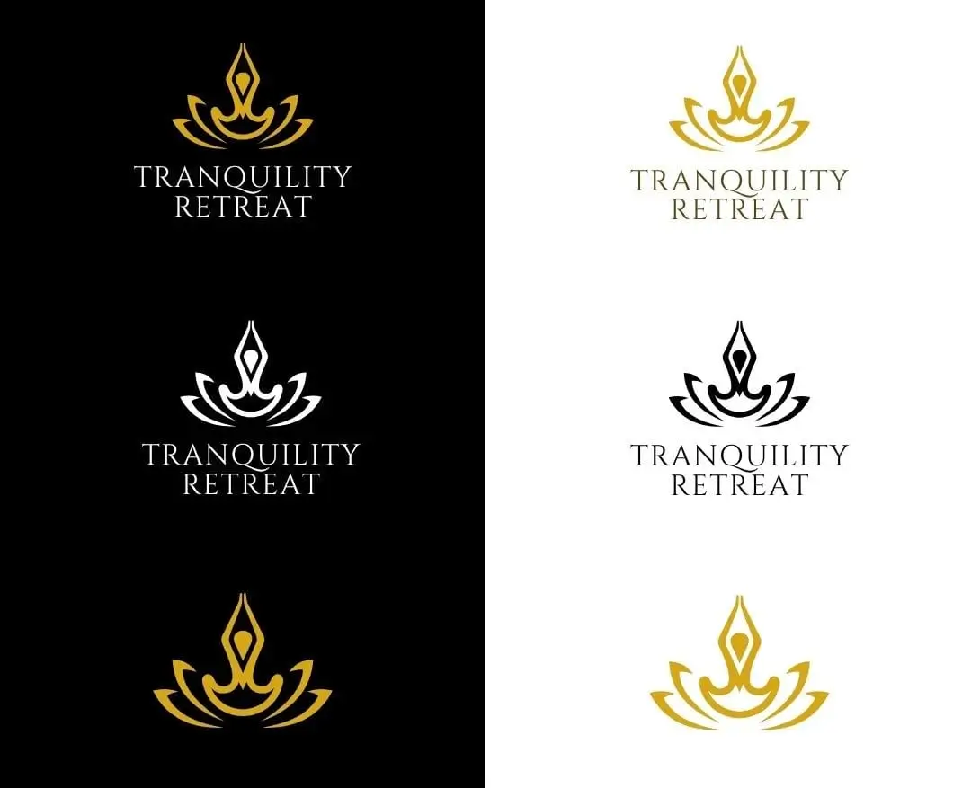
The logo combines an abstract lotus symbol with an elegant wordmark.
Designed as a fusion of a lotus flower and a meditative human figure, the symbol represents healing, mindfulness, transformation, and inner balance.
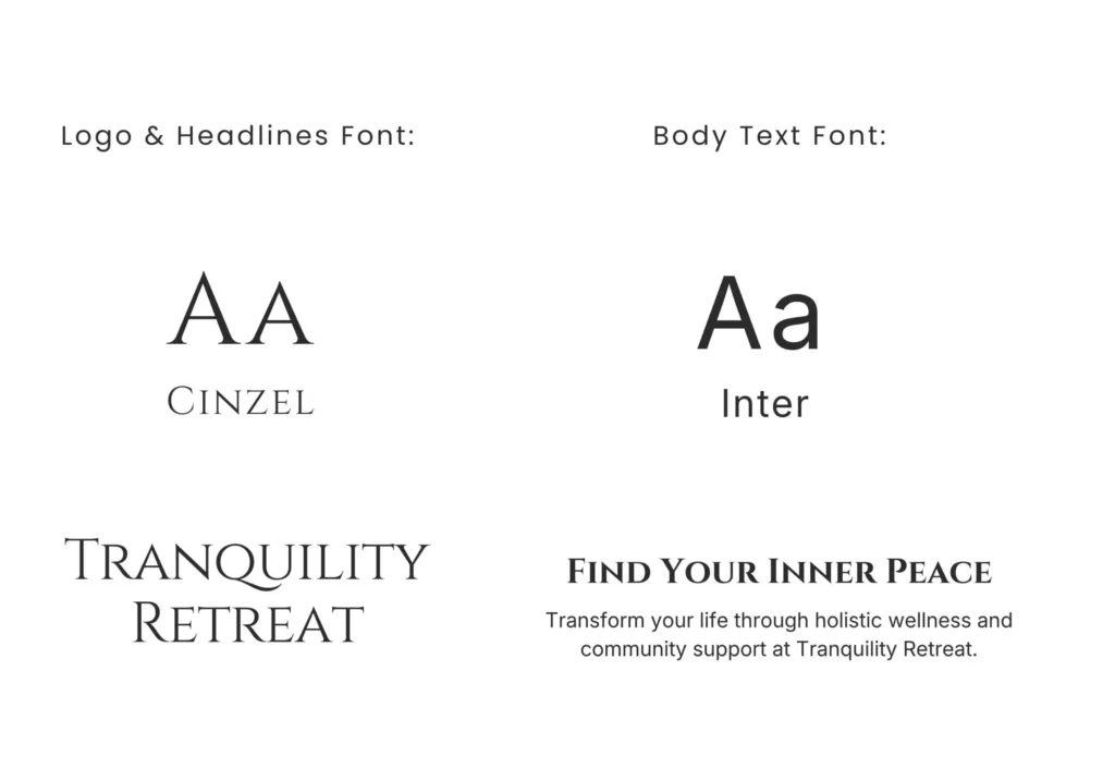
The wordmark uses Cinzel, chosen for its elegant and timeless character that brings a sense of refinement and credibility. Together, the expressive symbol and structured typography create a distinctive mark that feels both personal and professional.
Color Palette
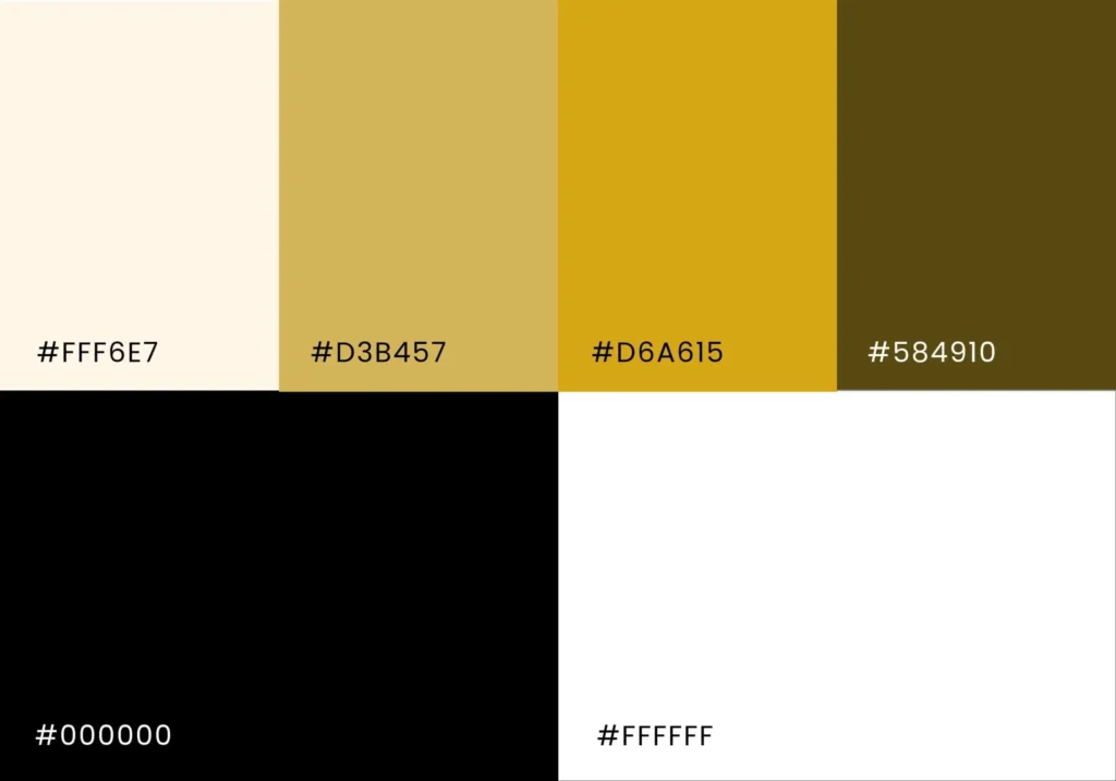
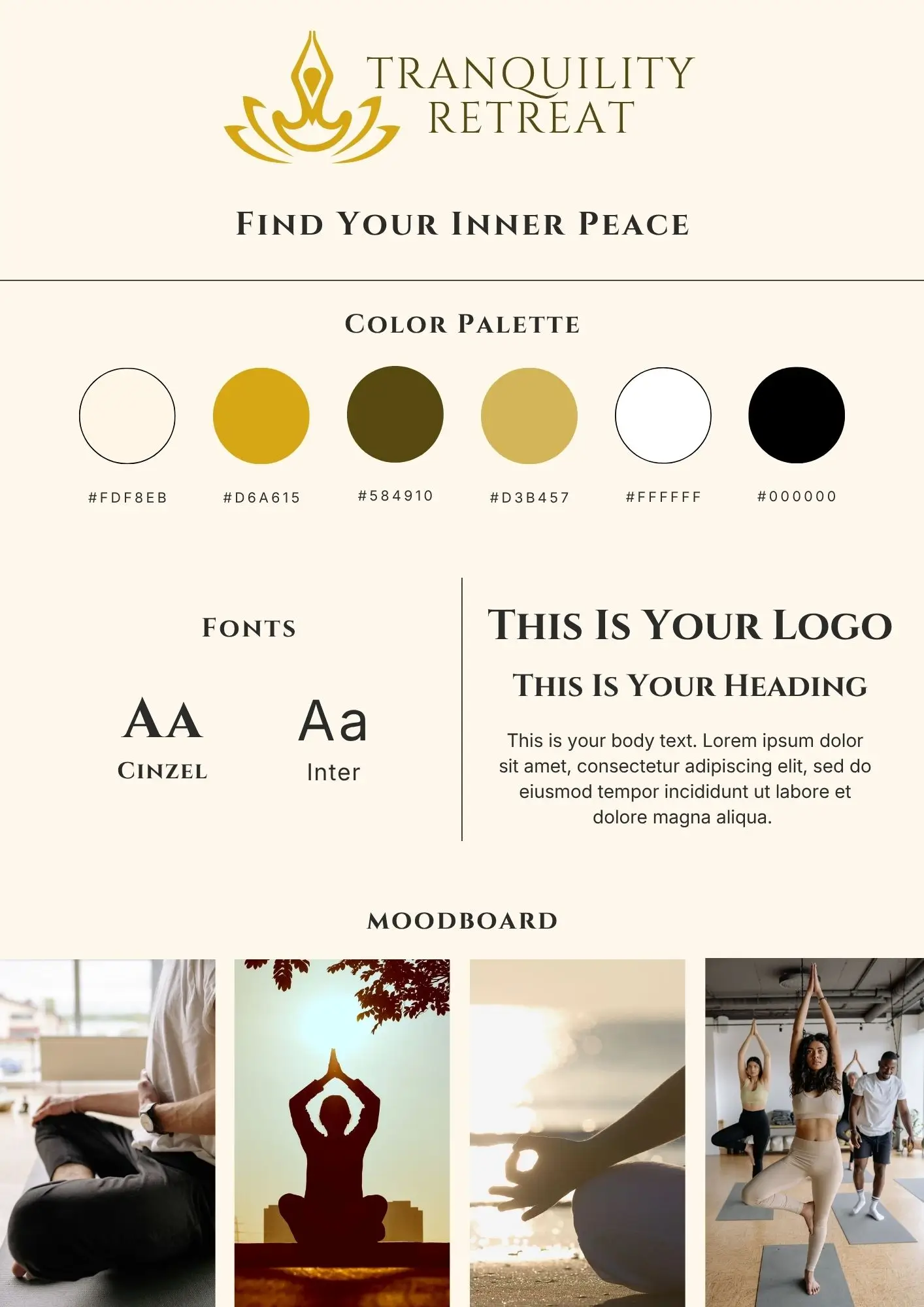
The color palette combines warm neutrals and rich golden tones to create a feeling of comfort, balance, and reassurance.
Instead of relying on the cool tones often associated with healthcare, the identity embraces warmer tones that create a more inviting emotional experience. Gold introduces optimism and personal growth, while the neutral foundation softens the overall palette and creates a calmer overall aesthetic.
Typography
Typography was selected to balance elegance with readability, reflecting both the emotional nature of the retreat and the practical need for clear communication.
Pairing Cinzel with Inter allowed the brand to combine visual sophistication with everyday usability. Cinzel brings character and distinction to the logo and headings, while Inter ensures body content remains clear and comfortable to read across both digital and printed materials.
Applying My Four-Pillar Website Framework
Every website I build is guided by four principles: business goals, brand alignment, user experience, and SEO.

01. Business Goals
The website was designed to function as both an informational resource and a lead-generation tool.
Because wellness and mental health services often involve significant emotional commitment, the website had to provide enough information for visitors to feel informed and confident before making contact.
To support these goals, the website was designed to:
- Clearly explain the retreat‘s philosophy and approach.
- Build trust and credibility.
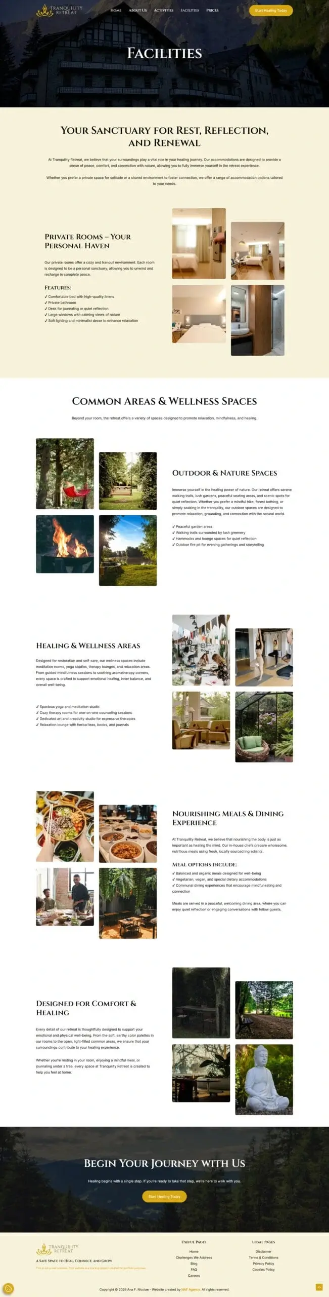
- Present the available programs, facilities, and activities.
- Address common concerns through supporting content and FAQs.
- Encourage inquiries and bookings.
- Establish authority through educational content.
- Support long-term organic growth through SEO.
02. Brand Alignment
The website was designed to communicate the same feelings that visitors seek from the retreat itself: calmness, safety, support, and personal growth.
Rather than feeling overly clinical or heavily focused on wellness trends, the website combines warm neutral tones, elegant typography, natural photography, and restrained use of colour to create a calm, refined aesthetic.
Together, these elements reflect the retreat’s focus on emotional well-being while presenting it with the professionalism expected from a premium wellness experience.
03. User Experience (UX)
The user experience was designed to make information easy to find at every stage of the journey.
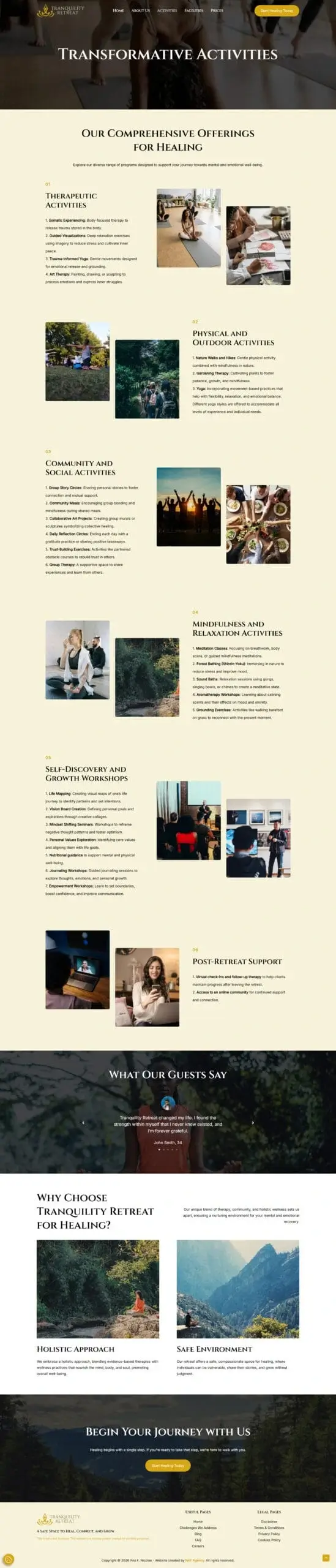
Content is organized around the natural questions potential guests have throughout their decision-making process, from introducing the retreat and its philosophy to explaining the programs, activities, facilities, and overall experience. This progressive structure allows visitors to build confidence as they move through the website before deciding to make an enquiry.
04. SEO & Performance Optimization
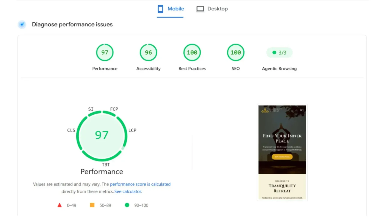
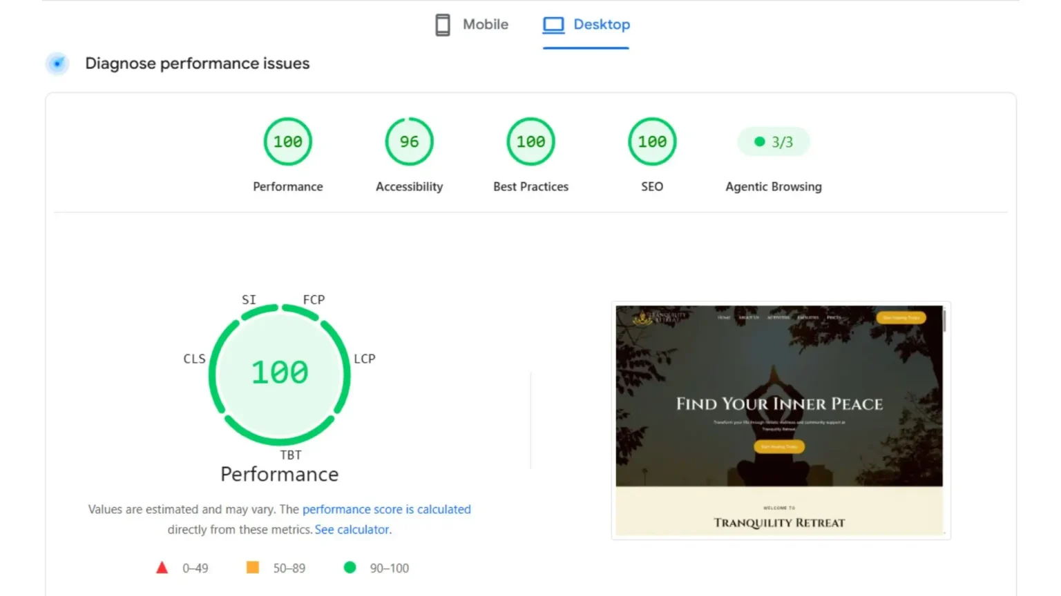
SEO best practices were incorporated into the project from the beginning to support both visibility and long-term content growth.
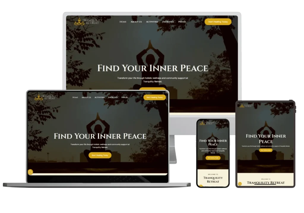
The website was structured using logical information architecture, optimized metadata, internal linking opportunities, clear heading hierarchy, and mobile-first design to support both search engines and visitors.
A dedicated blog was also included to support educational content around topics such as anxiety, stress management, burnout, mindfulness, and emotional well-being. Beyond providing valuable resources, this creates additional opportunities for organic discovery and long-term content growth.
Note: This project is intentionally excluded from search engine indexing using the robots.txt file, which may affect the Lighthouse SEO score. Aside from this intentional configuration, the website follows the same technical SEO standards and best practices I apply to real commercial projects.
Design & Development
The website was custom designed and developed in WordPress using Spectra and Astra.
Development prioritized performance, accessibility, and scalability through lightweight page structures, optimized assets, responsive layouts, and Core Web Vitals best practices.
The flexible architecture also allows the website to grow alongside the retreat, making it easy to expand programs, publish educational content, and introduce new community resources as the business evolves.
The Outcome
The project resulted in a complete brand identity and digital platform for a retreat centered on emotional well-being and personal growth.
Every element, from the brand strategy and messaging to the visual identity and website, was developed to communicate the retreat’s philosophy through a consistent and cohesive experience.
Together, they establish a professional foundation for attracting future guests, building credibility, and supporting the retreat’s long-term growth through both direct enquiries and educational content.
Ready for a Website That Supports Your Business?
Book a free consultation to discuss your business, your goals, and the website you want to build.