
The Brief
The Client & Concept
This conceptual project was inspired by a common challenge faced by many people today: wanting to improve their eating habits while struggling to keep up with the demands of a busy lifestyle.
Long workdays, convenience foods, conflicting nutrition advice, and an overwhelming amount of information online often make healthy living feel more complicated than it needs to be.
Amelia Brookes was created as a personal nutrition brand focused on simplifying that process. Through YouTube, Instagram, and TikTok, Amelia shares practical nutrition education, simple recipes, grocery shopping guidance, and realistic strategies for healthier eating. Alongside content creation, she provides one-on-one nutrition coaching designed to help clients develop sustainable habits that fit their individual lifestyles.
The Challenge
As Amelia’s audience continued to grow, social media alone was no longer enough to support the next stage of the business.
While her content introduced people to her approach, important information about her services, coaching philosophy, and expertise quickly became buried among posts. At the same time, conversations with prospective clients were spread across direct messages, making inquiries difficult to manage and creating unnecessary friction for people who wanted to work with her.
Therefore, Amelia needed a website to help her establish a stronger professional presence and provide a simple way for visitors to get in touch. Because the business had no existing brand identity, the project also involved developing its positioning, messaging, visual identity, and digital experience from the ground up.
The Objectives
Brand Objectives
The brand needed to position Amelia as a trusted nutrition professional while avoiding the restrictive and intimidating perception often associated with health and dieting.
Every aspect of the identity had to communicate warmth, expertise, and approachability, helping people feel supported as they worked toward healthier habits.
Website Objectives
The website needed to become the central hub of Amelia’s business beyond social media.
Its purpose was to introduce Amelia, explain her coaching approach, showcase her services, answer common questions, and create a clear path for visitors interested in working with her.
Services Provided
To support these objectives, the following services were provided:
- Brand Development (Brand Positioning, Naming, Messaging, Identity)
- Visual Identity Design (Logo, Color Palette, Typography)
- Website Strategy
- Information Architecture
- Website Design and Development
- Search Engine Optimization (SEO)
Brand Development
Brand Positioning
The brand was positioned around a simple idea:
Healthy living should feel practical, achievable, and sustainable.
Rather than encouraging strict diets or dramatic lifestyle changes, Amelia helps people understand nutrition and create healthier routines that fit naturally into everyday life. The focus is not on quick transformations, but on education, awareness, and long-term habits.
The target audience includes busy individuals and families who want to improve their relationship with food, make more informed choices, reduce dependence on processed foods, and build healthier routines without completely changing their lifestyle.
Naming
Because the business is centered around Amelia’s expertise and personal coaching approach, using her own name was the most appropriate direction.
This helps create a direct connection between Amelia and her audience, positioning her as a trusted professional guiding clients through their nutrition journey rather than as a generic health company. The simplicity of the name also allows the focus to remain on her knowledge, personality, and coaching philosophy.
Brand Message
The messaging was developed to reflect the brand’s positioning around practical, supportive nutrition guidance.
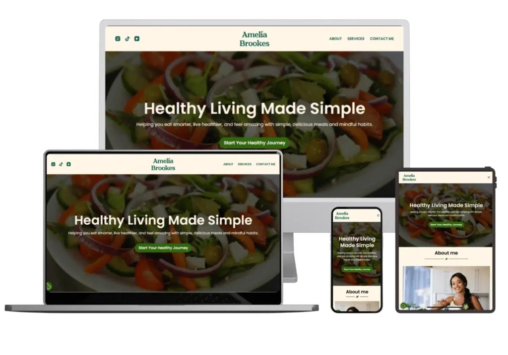
The headline “Healthy Living Made Simple” communicates Amelia’s core philosophy: healthier habits do not require extreme diets, complicated plans, or major lifestyle changes. This simple, memorable statement captures the brand promise while setting clear expectations for her coaching approach.
Visual Identity
The visual identity was created to balance professionalism with the personal nature of Amelia’s coaching.
Logo Design
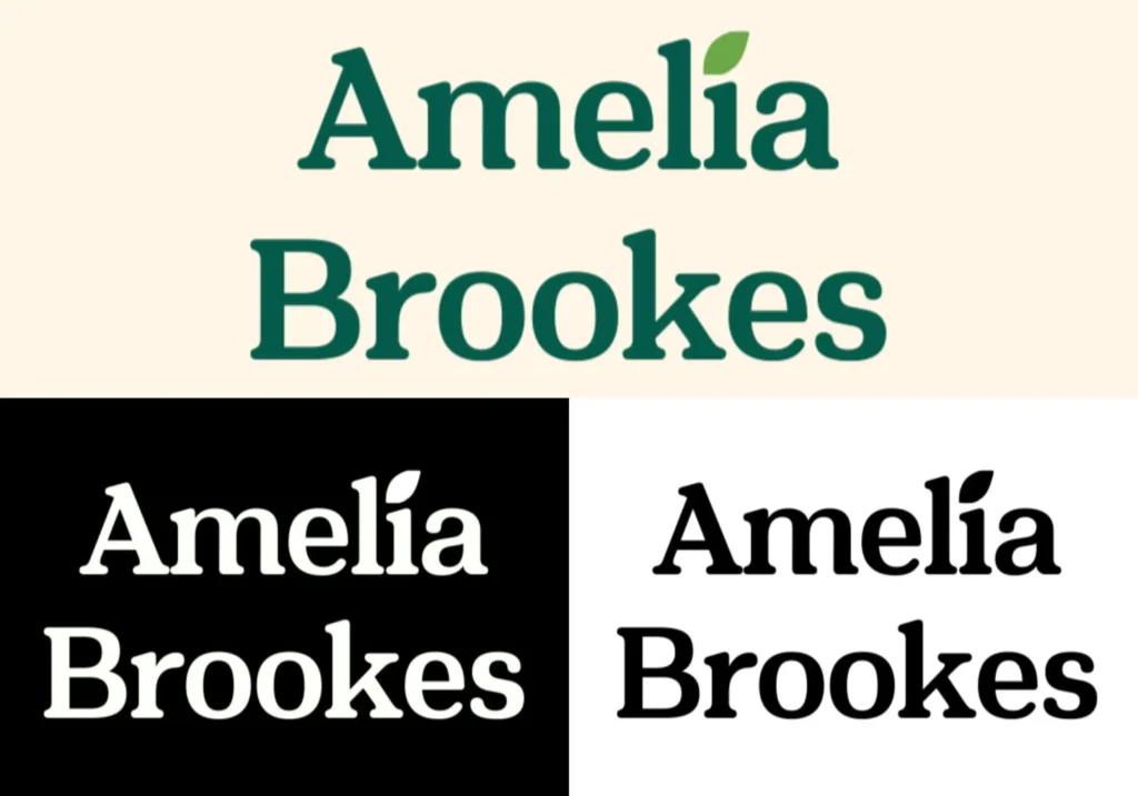
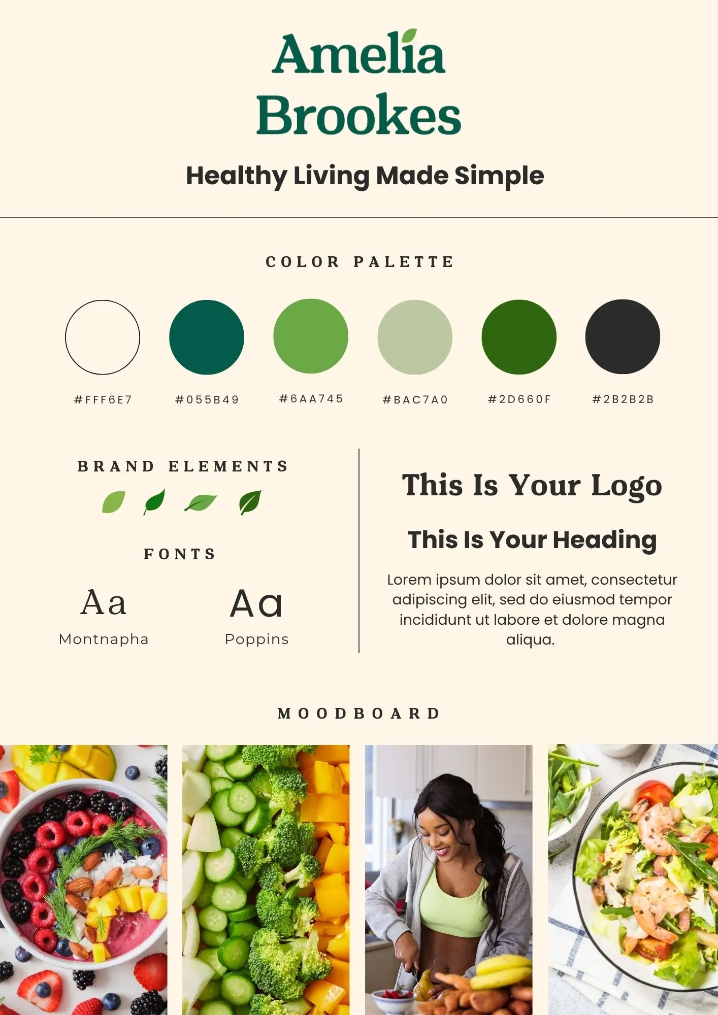
The logo combines a custom wordmark with a subtle leaf element inspired by the brand’s connection to healthy living.
Montnapha‘s soft, organic letterforms give the wordmark a distinctive and approachable character, while the integrated leaf subtly reinforces ideas of nutrition, freshness, and long-term well-being without relying on obvious health symbolism.
The result is a logo that feels distinctive, memorable, and suitable across both digital and physical applications.
Color Palette
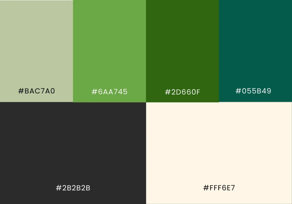
The color palette combines multiple shades of green with warm neutrals and darker supporting tones.
Because of the brand’s association with nutrition, freshness, and well-being, green became the foundation of the visual identity. The lighter shades create a calm and refreshing feel, while the darker greens add depth and strengthen the brand’s connection to health and nature.
Alongside the green tones, a warm neutral was introduced to bring balance and create a softer visual palette.
Typography
The typography system was designed to support both readability and personality.
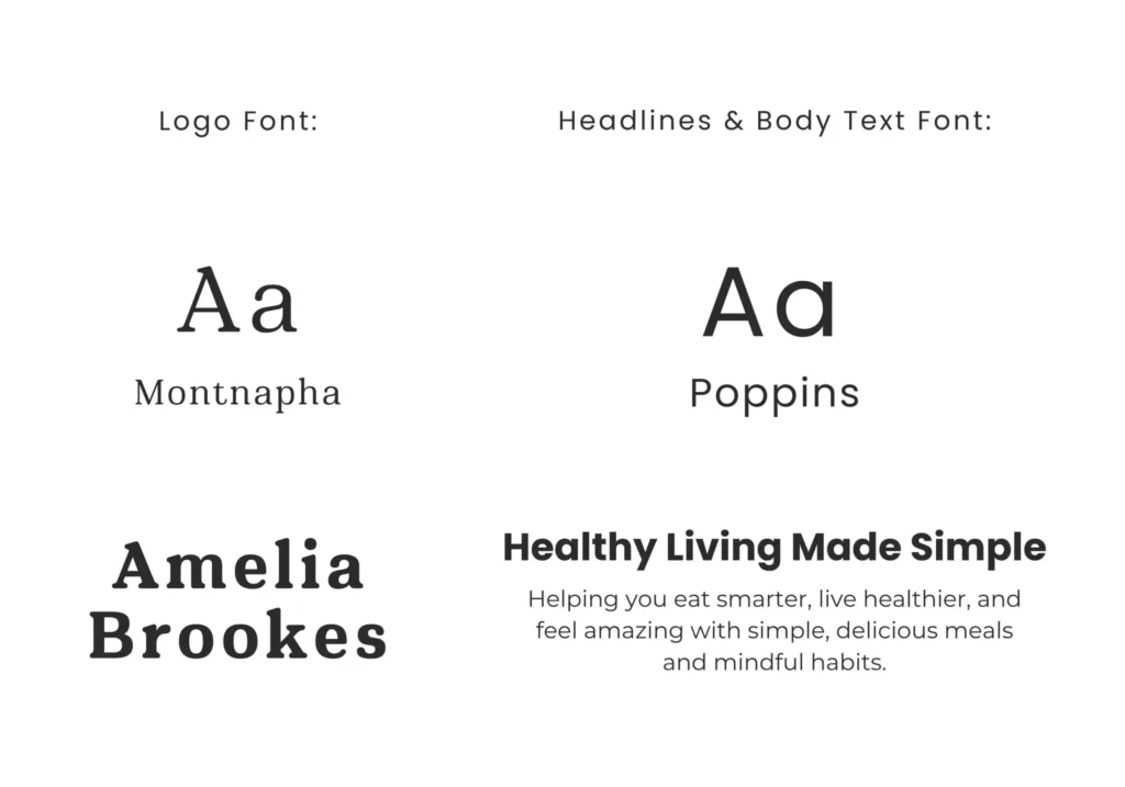
Poppins was selected as the primary typeface for both the website and supporting brand materials because of its clean structure, friendly appearance, and strong readability across different screen sizes.
Montnapha is reserved exclusively for the logo, where its softer and more distinctive character helps create a recognizable brand element without affecting usability.
Applying My 4-Pillar Website Framework
Every website I create is guided by four principles: business goals, brand alignment, user experience, and SEO.
01. Business Goals
The website was designed to support Amelia’s transition from content creator to professional service provider.
Rather than relying on social media as the main source of information, the website creates a dedicated space where potential clients can understand Amelia’s expertise, explore her services, and take the next step toward working with her.
Key goals included:
- Clearly communicate Amelia’s coaching services and approach.
- Create a professional online presence beyond social media.
- Build credibility through strategic branding and clear messaging.
- Simplify the inquiry process.
Because Amelia offers a focused set of services and most visitors are likely arriving from social media, a one-page website was chosen to create a direct and friction-free experience.
02. Brand Alignment
Every aspect of the website reflects the brand’s practical approach to nutrition.
Instead of using clinical imagery or fitness-focused messaging, the experience combines clean layouts, conversational copy, and welcoming visuals to create a more personal connection with visitors.
Throughout the website, the emphasis remains on education, encouragement, and practical guidance, creating an experience that feels as supportive as Amelia’s coaching itself.
03. User Experience (UX)
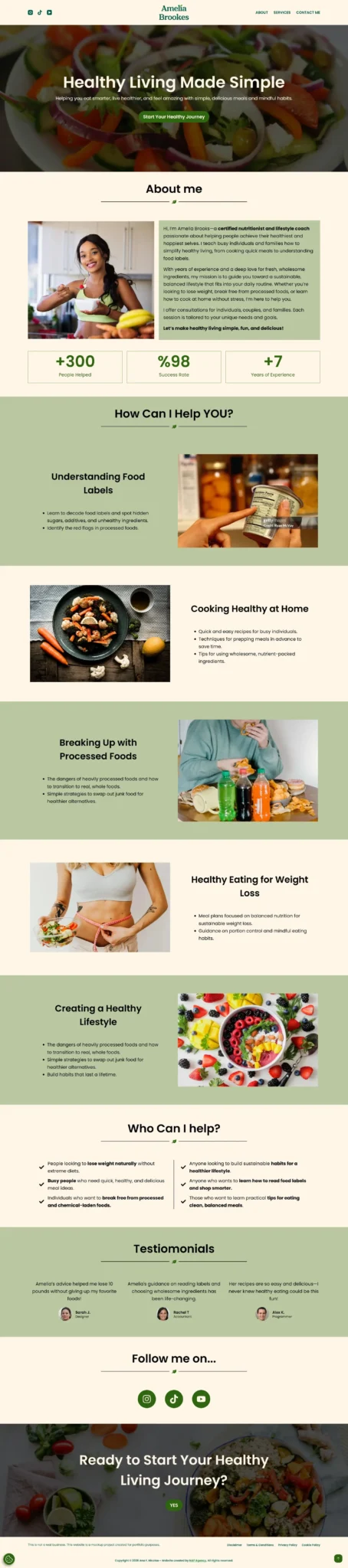
Because most visitors discover Amelia through social media, the website was designed to answer the questions potential clients are most likely to have before making contact.
The content follows a clear progression that introduces Amelia, explains her approach, outlines her services, and provides an easy path to inquiry. The navigation menu includes links to key sections of the page, allowing users to quickly access relevant information and move through the website more efficiently.
To enhance engagement without distracting from usability, subtle animations were introduced to add a sense of interaction while maintaining clarity and ease of use. The website also includes supporting legal pages, including a Privacy Policy, Cookie Policy, Disclaimer, and Terms & Conditions, to help establish trust and transparency.
04. SEO & Performance Optimization
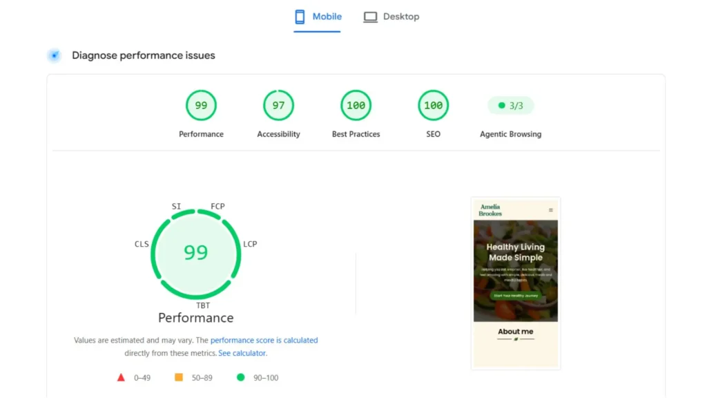
SEO best practices were integrated from the beginning to create a strong technical foundation.
The website was structured using logical heading hierarchy, optimized metadata, clean page architecture, and mobile-first principles to support search engine understanding and future content growth.
Note: This project is intentionally excluded from search engine indexing through the robots.txt file, which may affect Lighthouse SEO scoring. Aside from this intentional configuration, the website follows the same technical SEO standards and best practices applied to commercial projects.
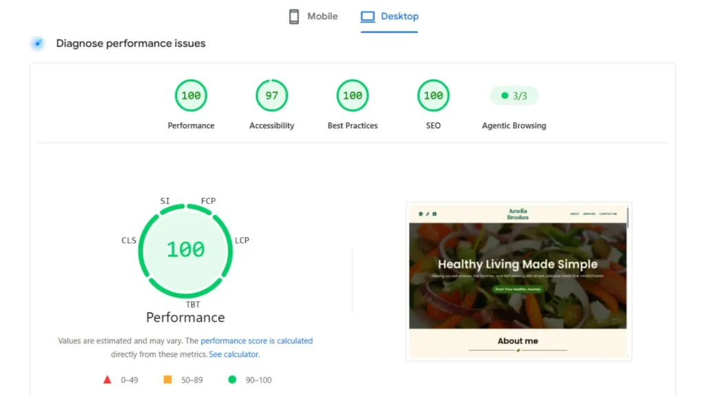
The website was custom designed and developed in WordPress using Elementor and Blocksy.
The build focused on creating a lightweight, easy-to-manage website that Amelia could easily update as her business grows.
Particular attention was given to responsive design, accessibility, performance optimization, and Core Web Vitals.
Design & Development
The Outcome
The project transformed Amelia’s online presence from a collection of social media content into a cohesive brand experience.
Through strategic positioning, a distinctive visual identity, and a website designed around education and conversion, Amelia now has a professional foundation for growing her audience and expanding her nutrition coaching services beyond social media.
The final result creates a clear connection between her expertise, her message, and the people she wants to help.
Ready for a Website That Supports Your Business?
Book a free consultation to discuss your business, your goals, and the website you want to build.